|
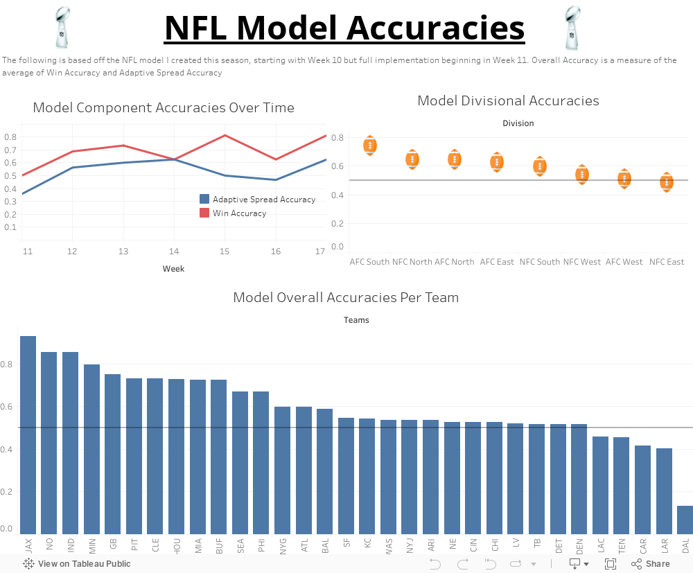
Hi! This is a visualization that shows how accurate my NFL Model using Excel has been these past few weeks. If you are interested in learning about the model, you can find the general page for the blog posts right here.
0 Comments
I am going to be completely honest here -- this is the most fun I've had making these dashboards. I thought that my creativity has peaked with this one and I learned a lot of new things about the Tableau interface.
This dashboard is about the different prop bets involved in the Superbowl this year between the Chiefs and the 49ers. A prop bet is one that isn't one of the main bets (moneyline, spread, O/U). Though I do address those in here, the focus is not on those variables. The focus instead is on fun aspects such as Gatorade shower colors and national anthem timing. My favorite part of this was the creativity I got to include with it. Some notable aspects of this dashboard that I enjoy are Demi Lovato's face being data points of her anthem singings compared to historical SB anthem singings, and that the footballs for the either team to miss a field goal viz are actually scaled onto an axis by their season FG% and not just randomly placed. This was so much fun to do, and I am very excited to watch the Superbowl tonight. Thanks for all who have been keeping up with my vizzes! 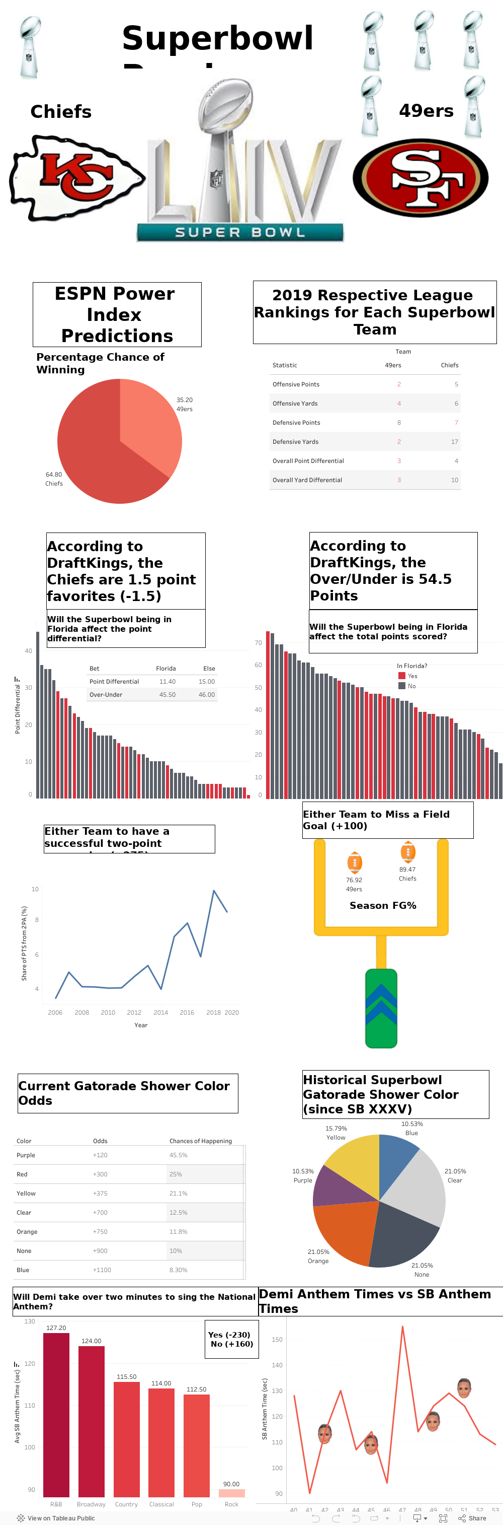
This has to be one of my most ambitious projects on Tableau yet, and it's not even a sports viz. This project took a lot of time and formatting. I actually had to reach out to one of the administrators for the data to use for this one, and luckily he was readily able to help me out!
If you are a Bucknell student, this one could be perfect for you. This room allows you to find your finals schedule without having to parse through that super large PDF file and also gives some cool stats on the finals experiences for different majors/class levels. One feature that I think is really cool with this dashboard is the "When is a room being used for testing?" because it allows you to see if a classroom is available at that time to study in. I think it was cool for me to take a break from sports vizzes, and make something that is useful to other people. I hope that first years who don't have a grasp on Bucknell finals schedules have the opportunity to use this and get themselves more prepared for this upcoming week! I hope a lot of people get to use this, and it's a very easy sheet to update in the future for next year! 
As I grouped the birds in the previous post (Eagles, Ravens, Hawks, Falcons), I am now going to do the same with the Cats of the NFL (Bengals, Jags, Lions, Panthers). This viz shows the historical winning percentages. It differs from the birds in that the general trend of the cats from pre-2000 to the last ten years is overall negative, whereas the birds were mostly positive.
I enjoy making vizzes like this, it feels like I am combining creativity with data presentation, and it is a good feeling. My favorite part of this is hunting down the right data and cleaning it up just right so that it's manipulatable. 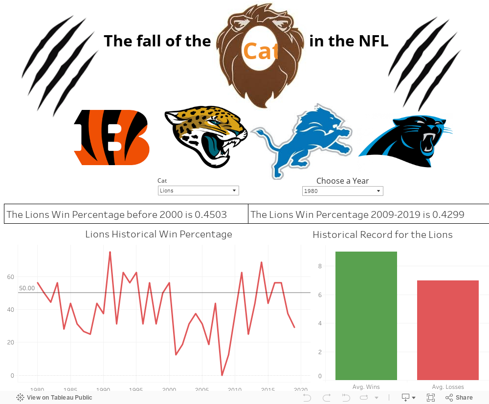
This is a dashboard that depicts the general trends of bird-based NFL teams from their 1975 through the 2019-2020 season. The Tableau dashboard is called the "Rise" of the birds because if you look at their win percentages before 2000 and within the last decade, you can see a vast improvement in each team.
Tableau Public doesn't have this technology, but on my local Tableau, the "Individual Records" flashes through the years for each team so you could see how they measure up via changes in the green and red bars. With Tableau Public, you have to do it manually to see the changes. 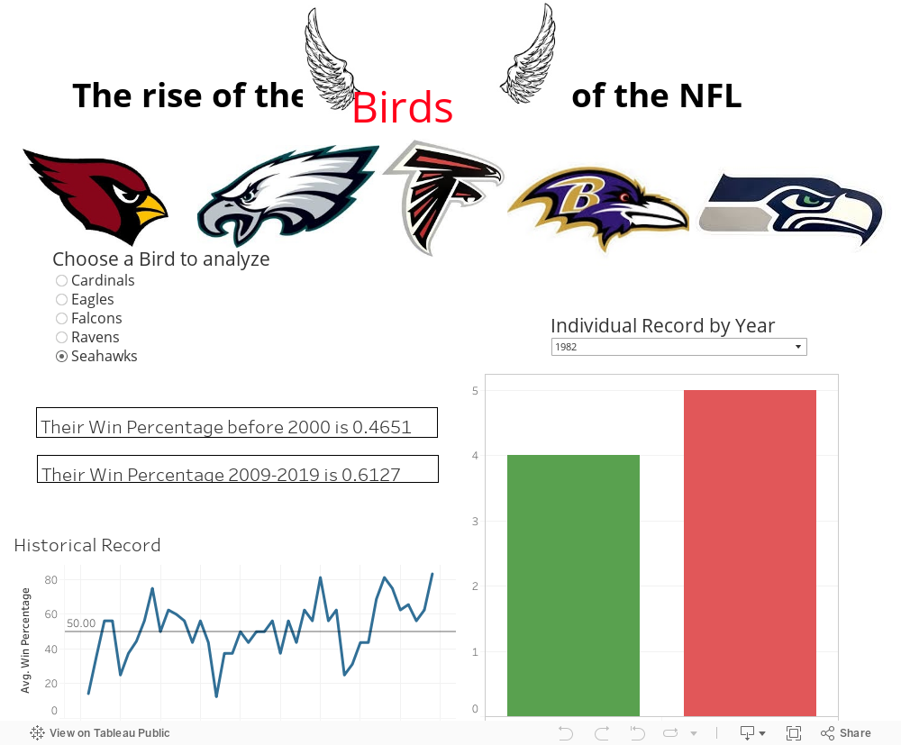
This is not necessarily a Sports Viz, but it is a very necessary debate to have. Currently, the world is in a crisis with the superiority of fast food chicken sandwiches. Popeyes recently released a chicken sandwich, and it has been proclaimed better than the long-time reigning Chick-FIl-A chicken sandwich. As a Floridian, Chick-Fil-A has always been an essential part of my state's culture. No other chicken sandwich has even come close to the Chick-Fil-A sandwich - that is until now...
My brother, myself, and our friend (sorry, small sample size) all went to our local Chick-Fil-A and Popeyes and brought the sandwiches home to have ourselves a taste test. We judged on a scale from 1-10 on five key aspects of the chicken sandwich: Breading, Buns, Size, Taste, Texture. All of these, if done well enough, combine to make the perfect sandwich. The results are shown below: 
Hello for everyone! I'm a student in my school's ANOP 270 class, which is Data Visualization for Business Analytics. I have enjoyed this class a lot, and I plan on extending what I have learned in here past the class. Right here is my final project.
As an avid sports fan, I find that the modern GOAT debate (LeBron vs Jordan) is a tough one, and my current stance on it deals with the evolution of the game rather than the two players individually - the eras of basketball were completely different. This project seeks to show that those said areas of the game are different through different metrics that are commonly analyzed today. I hope you enjoy, and I'm looking forward to making more of these! 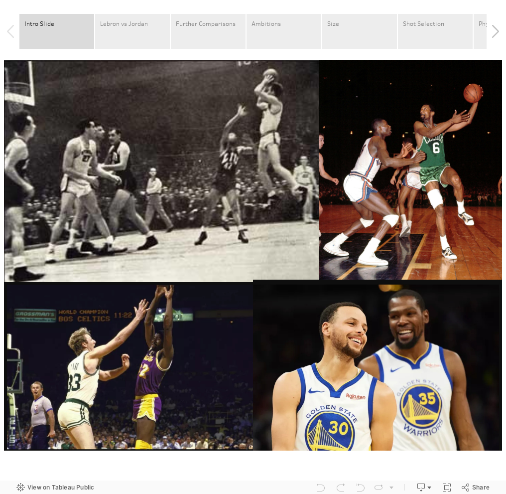
|